These days it is considered evident that art is a creation of worlds – essential prerequisites of which are creativity and critical thinking – rather than a projection of reality or the production of luxury items. To define the concept of a show as making worlds is therefore frivolous, to say the least. For the title of the show is no other than Making worlds – and in his statement as Biennale Director, Daniel Birnbaum ventures no further than setting forth shallow trivialities.
It has been a subject of concern for decades whether it is possible at all to realize a concrete concept (however interesting) in the scope of an exhibition of such magnitude. We have seen quite a number of curatorial ideas in the past years, and generally we have the impression that even if there is a clearly articulated concept, it is only more or less accomplished, owing to the unequal quality of works as well as their great divergence (based on the outcome of documenta 11 in Kassel, it is possible, though not easy).
Likewise, the problem with this year’s Venice Biennale was not that it would lack a beautiful, elaborate concept, but that nothing was delineated in, or by, the works, nor did the arrangement of works have a drift. In fact, there was not one truly groundbreaking work. Apparently, it would not hurt to have a more well thought out and circumscribed – yet slightly diffuse or diversified – concept, the lack of which reverberates in the quality of the show.
This making worlds concept seems to give rise to the victory of l’art pour l’art – and perhaps it is not beside the point that an assortment of works related to modernism permeated the two main exhibitions. To be honest, in the assembly of little monads, there are, perhaps consequentially, no political works (except for one or two insignificant ones) and barely any socially engaged works; in fact, very few of them reflect on anything at all (art included).
Perhaps it was fortunate to begin with the Arsenale, because the dullness of the concept was less noticeable at this more leisurely and divergent venue, whereas it was protuberant in the main pavilion (Palazzo delle Esposizioni) at the Giardini. The first impression was thus similar to the previous Biennales: there were works that spoke to me and ones that did not, and the ratio was not even that bad. Nevertheless, the panorama was overshadowed by the “coincidence” that a number of “big” national pavilions were quite boring.
I say coincidence, because the exhibitions of individual countries should not necessarily be related to the gigantic show organized at two venues by the Biennale Director. The French exhibition (Claude Léveque) is didactic, the English is clichéd (Steve McQueen’s otherwise beautiful, melancholic video about the deserted Giardini in wintertime is a little insubstantial for a Biennale exhibit), the German (Liam Gillick) and the American (Bruce Nauman) are boring. And it makes no difference that this year’s Golden Lion Award for Best National Participation was awarded to the American Pavilion – for a retrospective show. In fact, this even seems to downgrade Hungary’s Golden Lion from two years ago.
The show is permeated by modern art – partly in its formalism, partly in the spirit of creativity and neo-avant-garde innovation. There are works that are explicitly dated from the period of modernism and neo-avant-garde, like John Baldessari’s video Six Colorful Inside Jobs (1977) exhibited in the central pavilion. There are works whose creator seamlessly continued the spirit of modernism, like Lygia Pape’s work and Cildo Meireles’ Pling pling (6 coloured rooms, 6 TV screens, spatial installation, 2009) at the Arsenale.
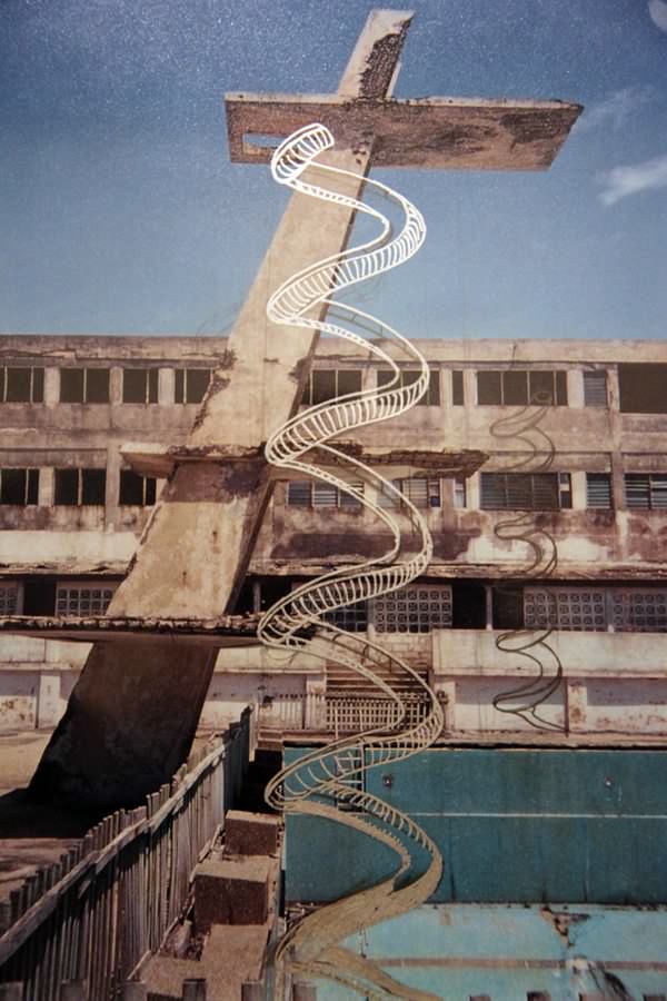
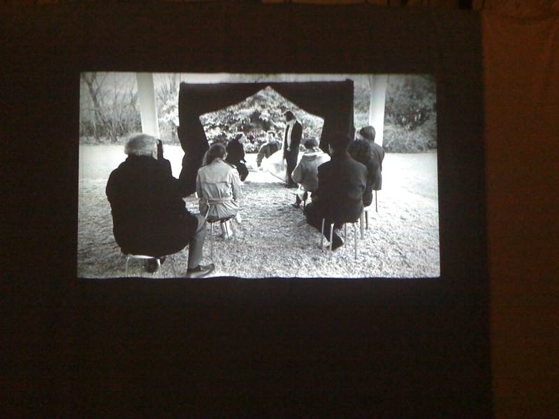
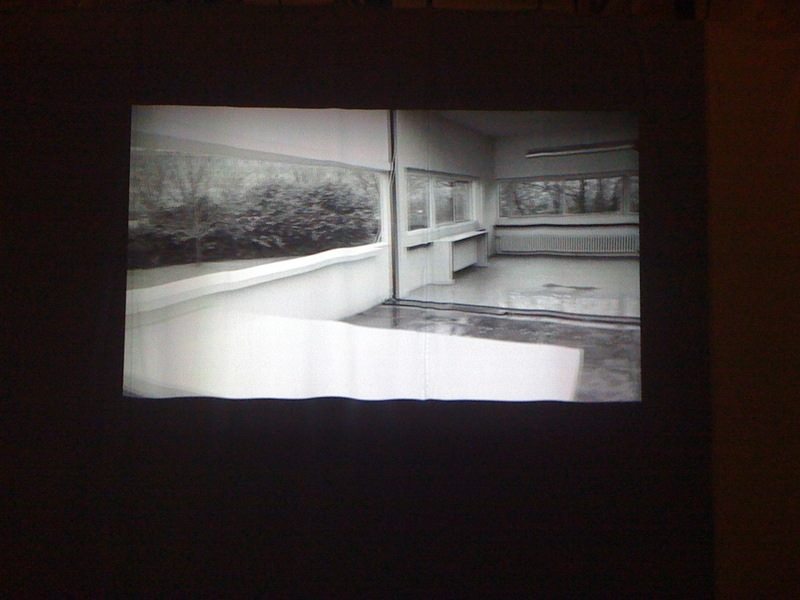
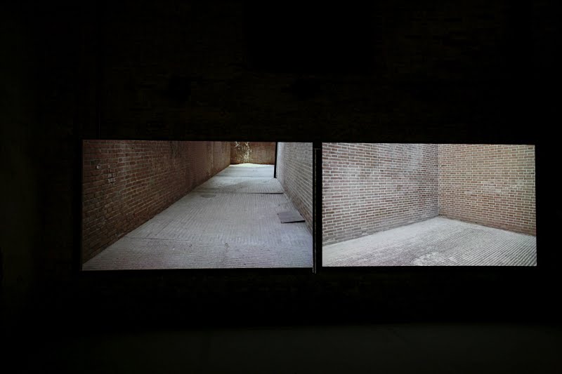
Later works operate with the modernist heritage: Carsten Höller’s architecturally inspired white spiralling tunnel and images, entitled Swinging Curve (2009), or Ulla von Brandenburg’s black and white film, Singspiel(1), taking place in Corbusier’s 1928 Villa Savoy, together with a labyrinth of draperies (2009). Sara Ramo’s two-channel video, Nearly full-nearly empty, features mysterious barely-events happening in two corners of a space lined with bricks, involving minimalist devices and movements.
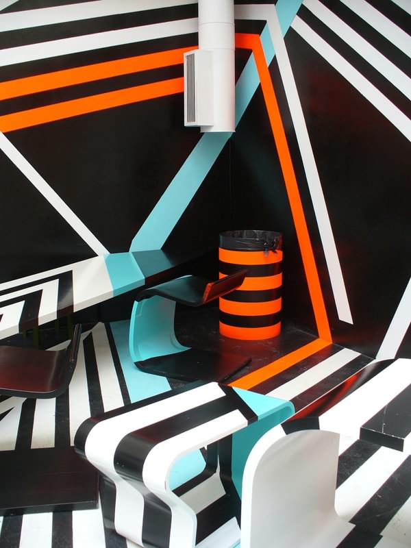
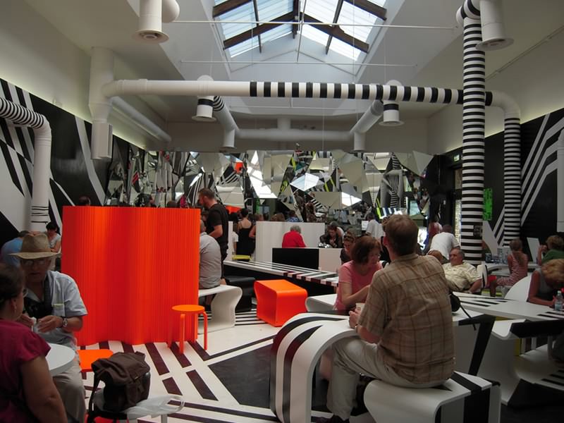
We find new modernist works (Tomas Saraceno) and ones that brush up modern art with a nuance. Such is the techno neo-op café designed by Thomas Rehberger in the extension to the main pavilion, where the entire space and furniture vibrates owing to the optical illusion caused by the eye-boggling colour design, to the extent that it even makes orientation difficult. Some works – though their sources are obvious – maintain a critical distance, or rather offer an ironic-critical reading (like Sherrie Levine’s at the main pavilion), and some appear not to break away from their source, yet reveal a fundamentally new way of thinking via little deviations.
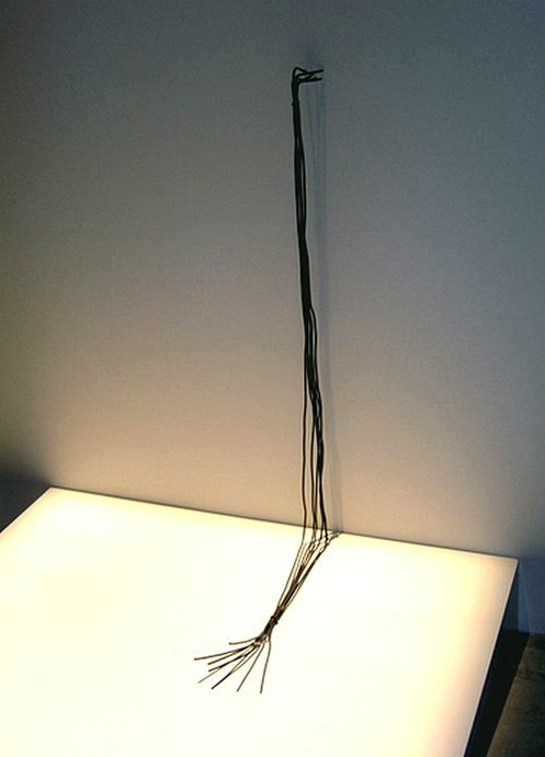
Anya Zholud’s installation Communications (2009) comprises bundles of wire that continue and discontinue (or simply reappear?) at different locations and in different lengths on the white ceiling of the Arsenale’s foyer, then high up on its dark brick wall, or on white pages. The work evokes the “soft” line of minimalism, but also technicism, while (though not in a very sophisticated way) its interrupted nature gives voice to its doubts.
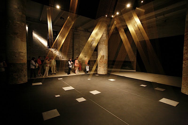
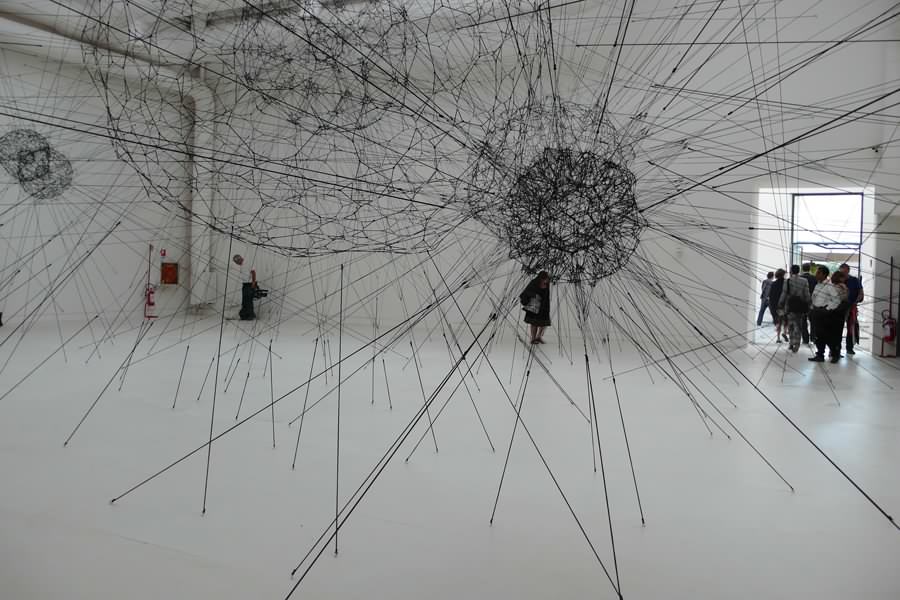
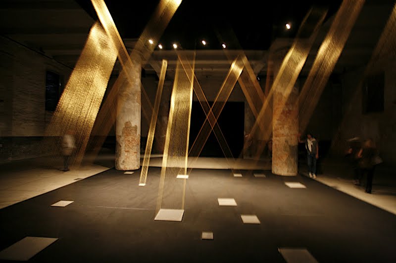
We were welcomed by grandiose spatial installations at both the Arsenale and the Palazzo delle Esposizioni: the very first darkened block of space at Arsenale was traversed theatrically by Lygia Pape’s rectangular streaks of materialised golden light , comprised of copper wires diagonally stretched from floor to ceiling (TTÉIA 1 C, 2002). Tomas Saraceno created enormous spheres in the largest white hall of the main pavilion, stretching out straight lines of black elastic thread (Galaxy forming along filaments, like droplets along the strands of a spider’s web, 2008).
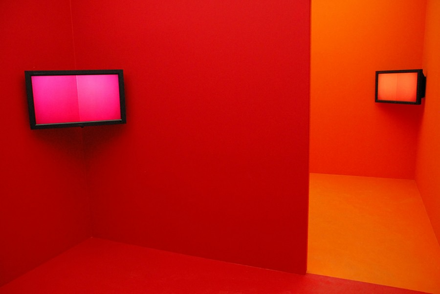
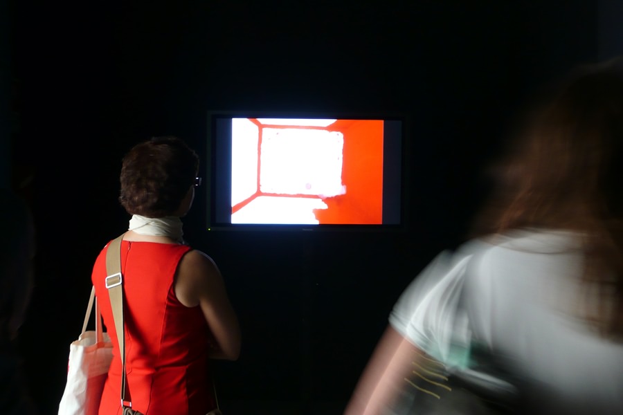
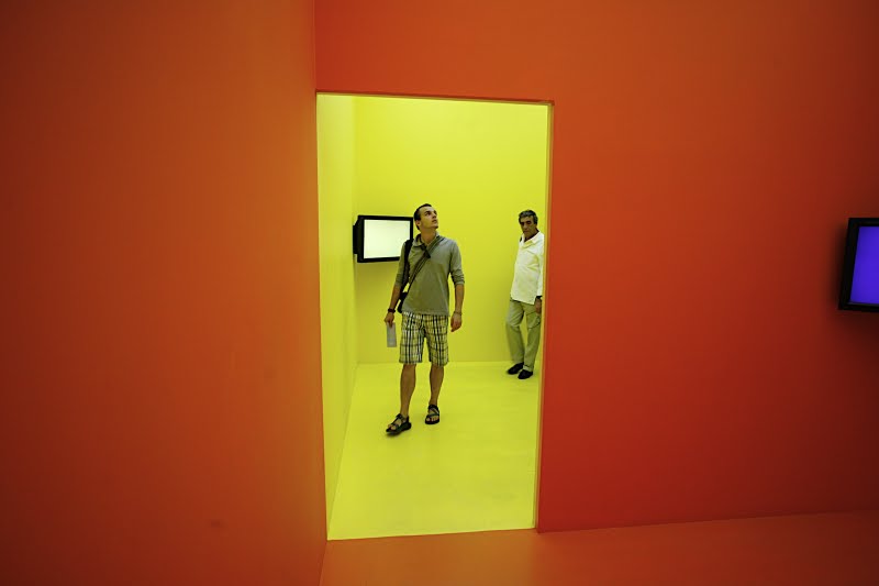
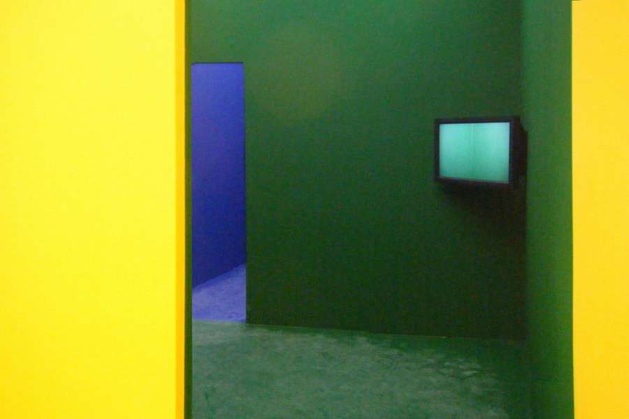
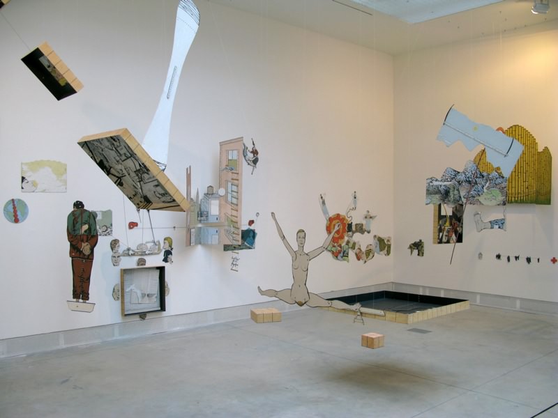
Exercises in colour theory seem to have been important for some reason: John Baldessari repaints a small enclosed room in different colour of the rainbow (from red to violet) each day in his video (1977): the rapid succession of images due to the short cuts is humorous even today. Cildo Meireles’ succession of colourful boxes range from red to violet as they open into one another, and although the TV screens of changing complementary colours have a pleasant effect, the installation has no more substance than a 15 year old student’s colour theory homework.
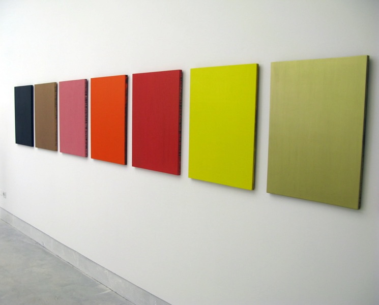
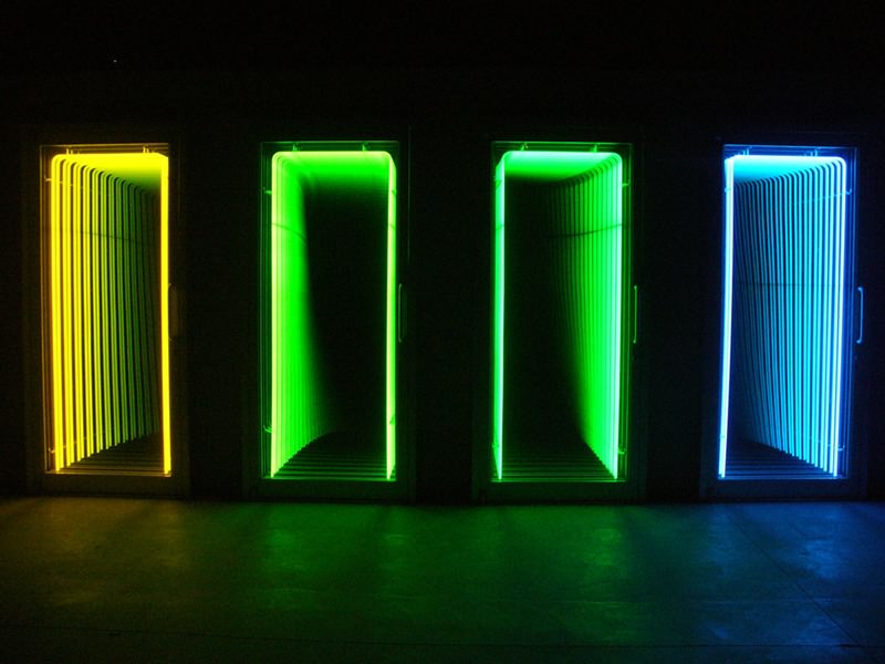
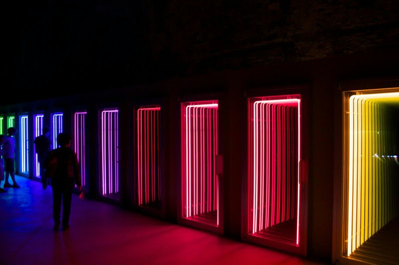
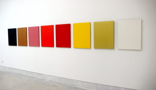
Iván Navarro’s Death Row exhibited in the Chilean section consists of 13 aluminium booths, lined by coloured neon tubes, again from red to violet, bearing a haunting resemblance to – and yet, with its title, mocking – the above exercises in colour theory. Sherrie Levine’s monochrome panel paintings – Melt down (After Yves Klein, 1991) – have different coloursthan the previous ones, but appropriating the great artist’s method, she takes an ironic approach to this extreme reduction – as well.
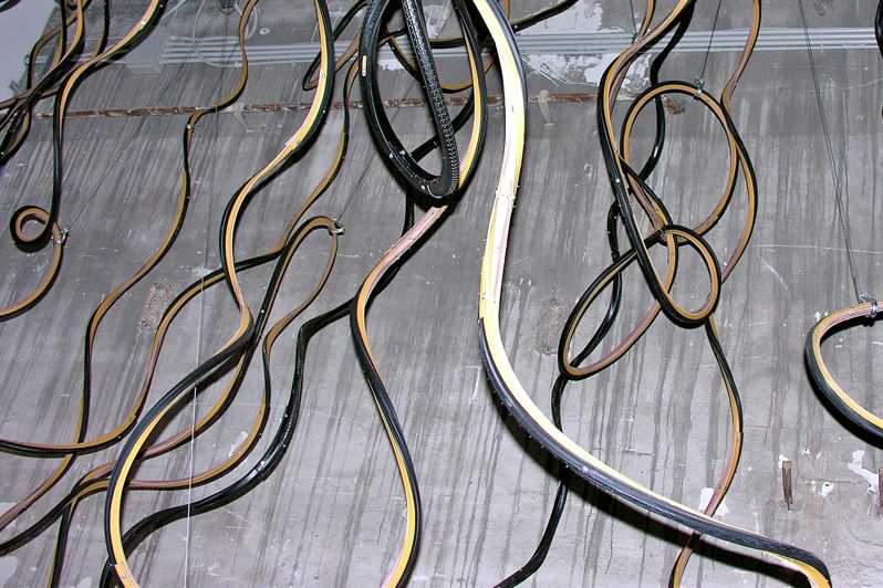
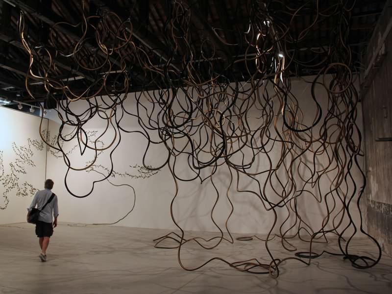
Other national pavilions also provide excellent instances of reinterpreting modernism. Latin America’s artists employ one of its legacies – imposing for me -, economy. Guatemalan Dario Escobar’s work entitled Kukulkan (2009) was composed of bicycle tires slit to form strings that were joined into long strings and hung from the ceiling to wind and wiggle like a bunch of snakes – economy and recycling on the one hand, and transubstantiation through this “minimal” intervention on the other.
The Cuban Carlos Garacoia’s Bend City (2008) is made up of red sheets of cardboard placed to form an orderly raster over white background: “houses” cut out and folded along straight lines and usually in right angles: witty, modernistic simplicity and precise engineering on the one hand, and the maquette-size, the great quantity, the colour-code of social significance and the title unite in adding a critical note to and reinterpreting the work that would seem simple as a school exercise at first sight.
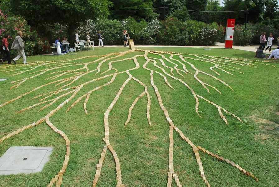
The Chinese Quiu Zhijie’s Domino comprises wooden tiles of various sizes that resemble domino pieces, arranged in a branching fashion. We see them all knocked down except for the one at their terminal merging point, which appears to be just on the verge of being taken down, or, perhaps, contrary to the subtitle – The small Knocking down the Big Wood (h: 80 cm) – resisting. Occupying a 20x30m strip of lawn, the work’s impact lies in its grandness rather than its “content”.
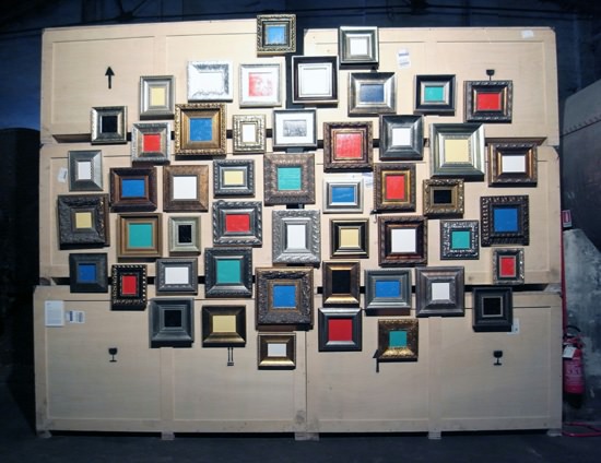
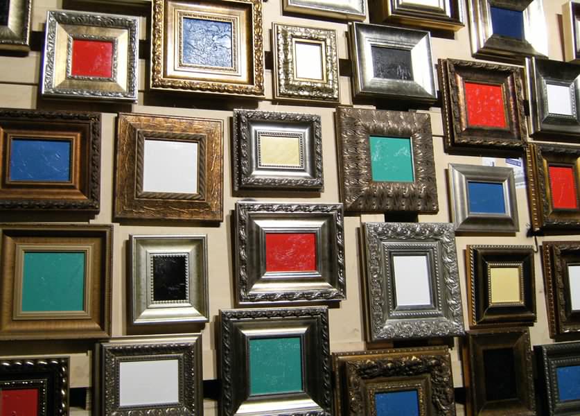
He Sen’s installation entitled The world of Taiji (2009) is made up of little monochrome (yellow, red, blue, green, white) oil paintings in highly ornamented yet conventional frames covering a wall of crates. The work reflects on both Chinese painting and the European modernist tradition inasmuch as the homogenous surface of the paintings is criss-crossed by barely visible calligraphic lines, evoking the tendrils and vegetation seen on traditional Chinese paintings.
The disappointing overall impression was topped off by the Italian contribution along with the one at the Venice Pavilion by lining up an array of kitsch from paintings in obsolete trans-avant-garde style through videos aware of the contemporary language to objects (Italian pavilion); from the shallow clichés of “clean” modernism (Venice Pavilion – inside) to colourful mirages of glass (outside).
I would rather not pry into whether this is the result of the openly commercialist attitude,(2) for, at least since Baxandall, it is evident – and should be laid down as a fact, to prevent rolling eyes – that art is (only) where the money is; the latter is a necessary, but not sufficient (never sufficient, we might banter) condition.
Therefore art criticism should not be based on whether rich buyers present themselves or not, or who use force (money) to bring art. For there is a long, complex and indirect relationship between money and art product, filtered through alternating systems of relations, always resulting in different scenarios. This, of course, does not mean that this relationship could not be the subject of scrutiny. All the more so, in fact.
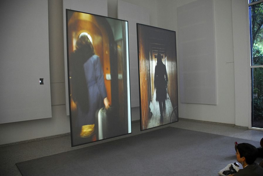
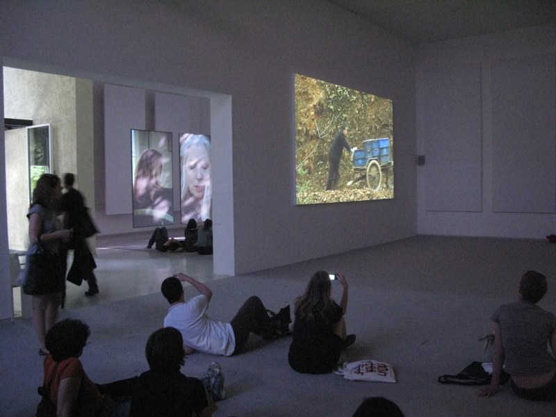
As opposed to all this, it was refreshing to see Fiona Tan’s participation in the Dutch Pavilion at the Giardini, along with a number of Eastern European works. Fiona Tan is – as always – interested in human destiny. (It is hard to write this down:) her poetically beautiful videos unfold a woman’s life on its decline; let us into the world of refugees; her looped digital sequences of black and white stills provide glimpses of the micro-events of life while reflecting on classical forms of portraiture.
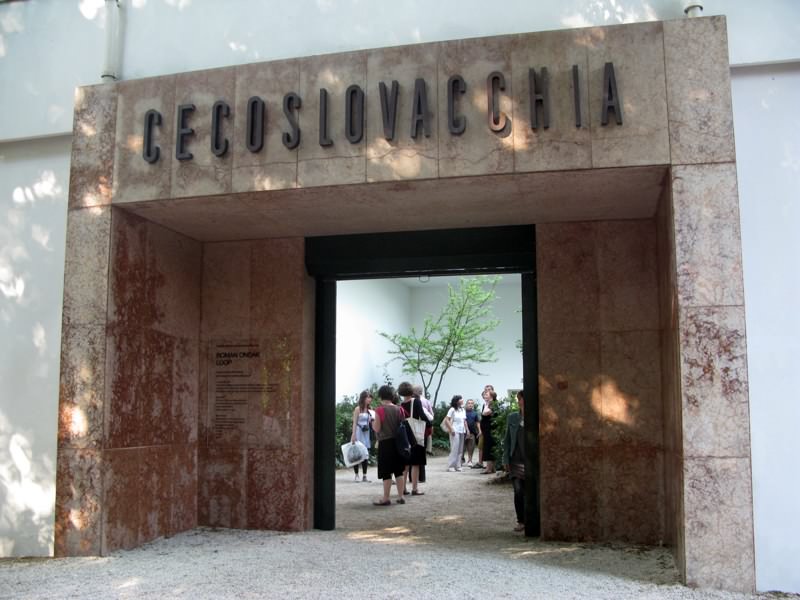
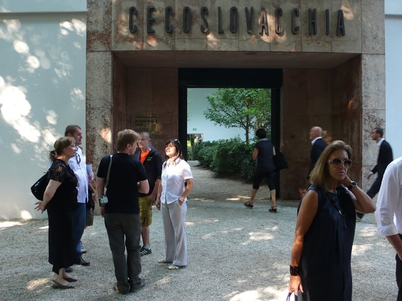
Roman Ondak modified the Czech and Slovak Pavilion with his Loop: he removed the doors and planted the Giardini’s vegetation inside – wittily showing the relative relationship of within and without. The Serbian Zoran Todorovic’s installation Warmth was comprised of bales of warm blankets, which – as we were informed by the accompanying videos – had been felted from bunches of hair collected in hair salons.
The Romanian Stefan Constantinescu’s video Troleibuzul 92(3) is a bloodcurdling – though realistic – absurd: a jealous man preparing for a showdown delivers a mobile phone monologue while riding a trolleybus around the streets of Bucharest. Ahmet Ögüt and Banu Cennetoglu’s Exploded City at the Turkish Pavilion (Arsenale) was a historically sensitive work. With accompanying documentation, they installed a large maquette of a city: a montage of buildings and vehicles that had been bombed by terrorists in the past decades.
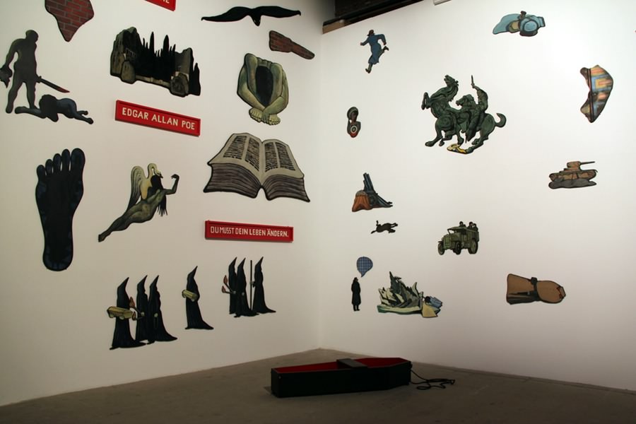
Along with Gordon Matta-Clark’s sensual conceptual video and drawings from the Trees series (1970-74), Öyvind Fahlström’s rich, playful and humorous installation with roots in pop-art: Dr.Schweitzer‘s Last Mission (1964-66) appeared inspiring in the main pavilion. Jan Hafström’s The Eternal Return (2003) at the Arsenale seemed to resonate with the latter: it was an arrangement of cultural icons mixed with globally known (artist) names and images from present day press. His humorous installation offered a number of associations and an opportunity of transit between high and popular culture, past and present.
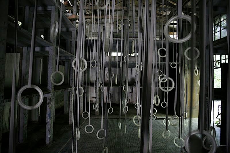
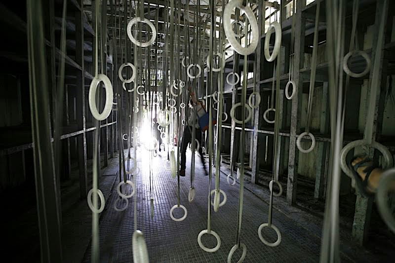
Works related to the flora – trees, flowers and all kinds of vegetation – are slightly surreal in the Arsenale and its garden (newly dedicated to the Biennial). Think of William Forsythe’s installation The Fact of Matter, which is a forest of gymnastic rings. Such an array of – usable – sports equipment is surprising in this constellation, so its impact lay in the contrast between its emphasized artificial nature and the romanticism of the garden shed.
While in this case the mass of gymnastics equipment had a magical air in the aura of the environment, Sheela Gowda’s enormous installation, Behold, comprised of steel bumpers hanging on several meters long threads of braided black hair was ruined by wrong placement: this is a true white-cube work, the values of which only manifest in visual dissociation from the environment. Nevertheless, it was drowned out by the visually powerful space of the Arsenale – even if it had been hung on a white painted strip of wall.
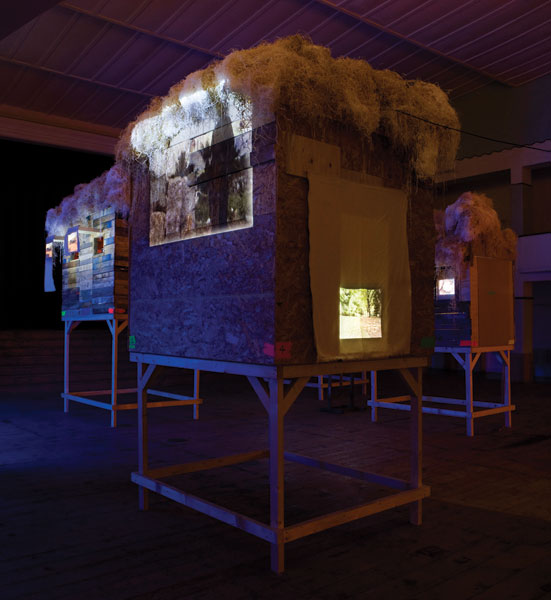
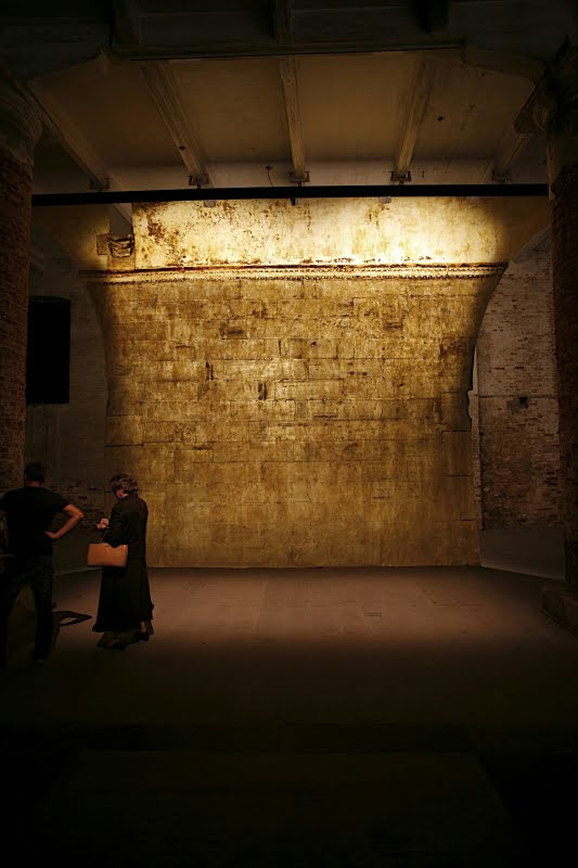
The issue of cultural identity was touched upon by just a few works, such as the Cameroonian Pascale Marthine Tayou’s installation Human being, occupying an entire hall with videos, objects and sculptures, evoking an African village with its stilt houses, ancient and new rites. Jorge Otero-Pailos removes the dust that settles on buildings with a method well known in architectural restoration in his series The Ethics of Dust. In this case, as a site-specific project, he lifted off a section of the façade of the Doge’s Palace onto a latex sheet.
Chen Yun’s Constellation No.3 is a humorous reflection: the flickering LEDs of the scores of domestic and personal electric appliances scattered around the floor of a darkened room are mundane, technicist reflections of the starry night sky. The placement of the installation was well calculated: the spectators, arriving from the brightly lit hall, at first only saw the constellation of stars, and the rest remained invisible until their eyes adjusted to the darkness.
All things aside, Venice was worth the trip. During the summer, exhibitions of Rebecca Horn (Fata Morgana, Palazzo Bevilaqua La Masa), Mona Hatoum (Fondazione Querini Stampalia), and Peter Greeneway (monastery on San Giorgio Maggiore) were on. In any case, the fact that the exhibition of a private collection (Francois Pinault-s at Palazzo Grassi and Punta della Dogana, entitled Mapping the Studio) should have more coherence and tension than the Biennale itself, is something that makes us wonder.
Translated by Daniel Sipos
(1) Songplay
(2) As surmised by several authors (Edit András, Gábor Andrási, Zsófia Bán) in Muérto’s 2009 July-August issue.
(3) Trolleybus No. 92