„Just hop in the ABC.”
This is the sentence that always comes to my mind, whenever I intend to pay a visit to a grocery store. When I was a child, almost all the groceries bore that name, especially those in the cities. According to my memories, these shops constituted a huge chain – under state governance naturally. These ABCs usually occupied standalone buildings of a functionalist, modestly modern look, equipped with the most and greatest windows possible. The façade carried three letters, each a different colour: A, B, C, made of neon or plastic. Now it seems to me, that these letters did not behave as logos, because there were smaller or greater differences between each shop’s sign.
The variety of goods was not big, products were offered in uniform packages. Uniformity of image was not a part of the business-strategy, but a necessary consequence of socialist economic planning. The image of the products lacked any kind of attraction, it needed none. Competition was out of the question, they only aimed to satisfy the needs of the population. Consequently, colours or images rarely made it on to the cover of these products, advertisement was non-existent, thus the packaging had a distinct air of tamed constructivism. The grey machine of power was not so suspicious toward the design of everyday life.
After the change of regime, western chains of supermarkets started to appear, and next to moving into freshly built houses, they slowly occupied the increasingly run-down buildings of the ABCs. They renovated these buildings and transformed them according to the design needs of the actual chain of stores. Partly leaning on exported goods, these stores managed to achieve the western kind of variety of products that was unthinkable in Hungary before. Complex marketing campaigns helped to establish the necessary imagery; colourful, stimulating photos on the packages became frequent. With the conscious application of the tools of persuasion, each chain developed its own image, depending on their choice of consumer-types.
It was most conspicuous when two supermarkets aiming to reach two different levels of consumers settled next to each other. Calbe am Sale in Germany boasts a square that has a PLUS on one of its sides. Its looks are reserved; its inner construction is transparent, undecorated and simple; this supermarket is furnished with a certain “protestant austerity”. Its variety of products is small and on the cheap side, the shelves are short, the corridors between them are wide. On the right side of the square, there is a Kaiser’s, with its plenitude of advertisements, consumer-music, and a “baroque” variety of products. Corridors dwindle among the tall shelves. Self-service system is complemented with bars with a personnel, who wrap the things you buy two or there times, and the prices are distinctly higher then that of the PLUS across the square. There is a similar opposition in Budapest, on the corner of Gazdagrét Housing Estates, where the two supermarket-chains mentioned face each other from the two sides of a road. The consumer can decide based on his or her personal preferences or style.
At the same time, ABCsurvived the change, though it’s not a unified chain anymore, only a bunch of miniature family-businesses, using the name ABC to ring some bells.
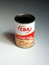
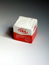
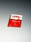
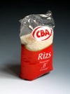
It was already in the nineties when I discovered these self-produced, undecorated goods on the shelves of the big western chains. These packages featuring almost nothing except from the colours and logo of the company are modest and humble. It is almost provocatively unimaginative in the face of the deluge of hysterical images. There are reasons for it: these products do not need to be marketed, they are sold in house. Thanks to the hard bargain the supermarket drives with suppliers and manufacturers, their prices are very low. There is no need for promotion, it’s enough to make a heap of them on the shelves; they instantly catch our attention in a supermarket-space overwhelmed by visual effects. At this stage, these products are the most conspicuous on the shelves – they are the leading edge of modernism. I say modernism, because modernism is the paradigm that questions the recent “academic” set of rules, and proposes unexpected formations against it.
There is a hint of complicity with the consumer hiding in this gesture: “We make it possible for you to buy the same quality without having to pay for its additional costs. But if you intend to buy extra quality, we provide you with that as well.” This sympathetic communication is supposed to obscure the fact, that supermarket chains frequently use fictional concurrency to boost consumption.
In-house marketing of self-produced goods is not unfamiliar for Hungarian consumers either. National chains shape their images to suit the national market and national mentality. CBA’s name itself is a huge asset, it questions the former, traditional name, while emotionally motivating consumers: it evokes nostalgia, and suggests a new direction.
The expansion of national chains – especially CBA – is characterized by their practice to integrate tiny stores, saving the actual interior, peculiar opening times, etc. It’s mainly the use of logo, cheap prices and the presence of self-produced goods that establishes the image. CBA has grown quite a lot in the last few years, we find bigger and bigger shops in the chain, and it started to expand into Croatia and Rumania. It is possible it would eventually become a multinational company, though at the moment it distances itself from those in its advertisements (in Hungary!) using a slogan that builds on national emotions: The national chain.
The most exciting momentum of these processes, described above, is the way late capitalism invented the global look-alike of soc-real product to visually distinguish self-produced goods, and that might as well be called cap-real.

