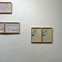
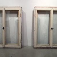
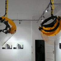
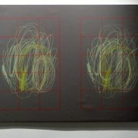
One of the points of departure at the inception of the exhibition In Duplo – the Semblance of Uniformity was the question of the extent to which the genre of a thematic exhibition could hold the attention of an audience. What effect does a situational framework that can be quickly encoded and described in simple terms have on the level of activity of the spectators? Our experience suggests that it is difficult to find the optimal balance between the subtle and the primary articulation of the message of a thematic exhibition. For this reason, we have displayed as well as made audible the questions that are examined and presented here in a layered system, at the same time, by using different media, drawing attention to different strata of meaning.
The theme of the exhibition is uniformity, repetition, and reproducibility. The choice of theme was based on the subjective observation that the works of several figures of the contemporary Hungarian art scene include duplicated visual elements. And while this formal solution and the theories that bear on it can be considered ancient topoi of art (which as an immediate antecedent came to the foreground due to 20th century forms of technical reproducibility), the subject appears to be inexhaustible, and we must reckon with its presence in contemporary art.
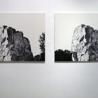
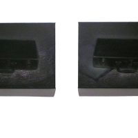
The visual code, therefore, is simple: everything is a duplicate. However, beyond this easily describable schema, the exhibition is supplemented with an audio informational package that offers further explanation. The audio guide contains extracts from interviews with artists whose works are on display in the exhibit. The recordings provide details of viewpoints and approaches, sometimes divergent, sometimes convergent, that gave the creative impetus of apparently similar works. Thus, while on the visual level uniformity dominates, the audio guide offers a more subtle and relatively varied impression.
In Duplo plays a game with time, with the attention span of the spectator, and the familiar schematics, frameworks and stereotypes with which we tend to approach a thematically organized exhibition. This is another reason why it makes use of a gesture so forceful that it is reminiscent of the brushstroke of a caricaturist. By placing the duplicated works beside one another, an exaggerated contrast is created between them, from which a caricature-like portrait of an exhibit focusing on uniformity takes shape. The exhibition strives to call attention to the complexity of the issue at hand, which gestures not towards an anticipated homogeneity, but rather in the direction of diversity.
